Quobis
for Quobis
- Branding
2020

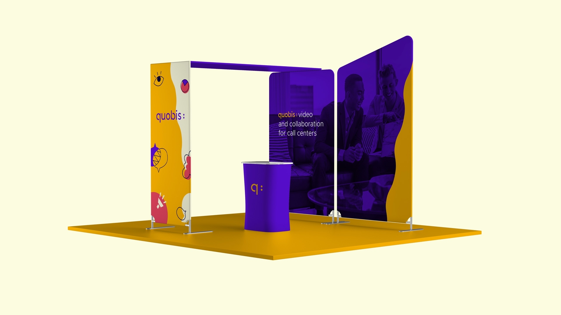
Collaborating with Spain's leading communication tech company
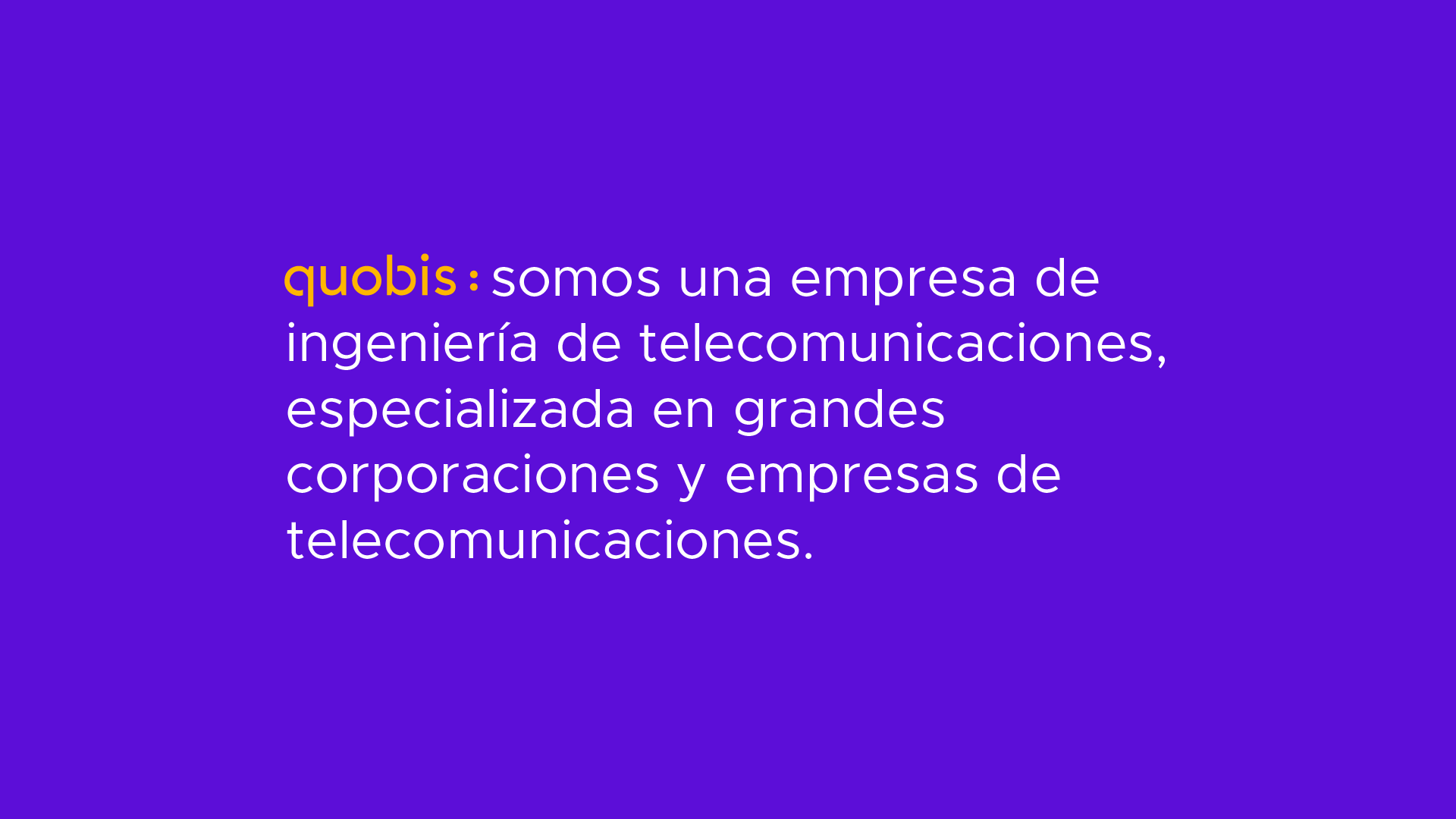
Quobis is a key player in Spain's communication tech market. During my stay at Miew Creative Studio, I was challenged to rebrand the tech company. By using Spain's connection with art and using a new set of bold colors, a new conversation was started (that's what the brand signifies, and that's what it was represented) with the market.

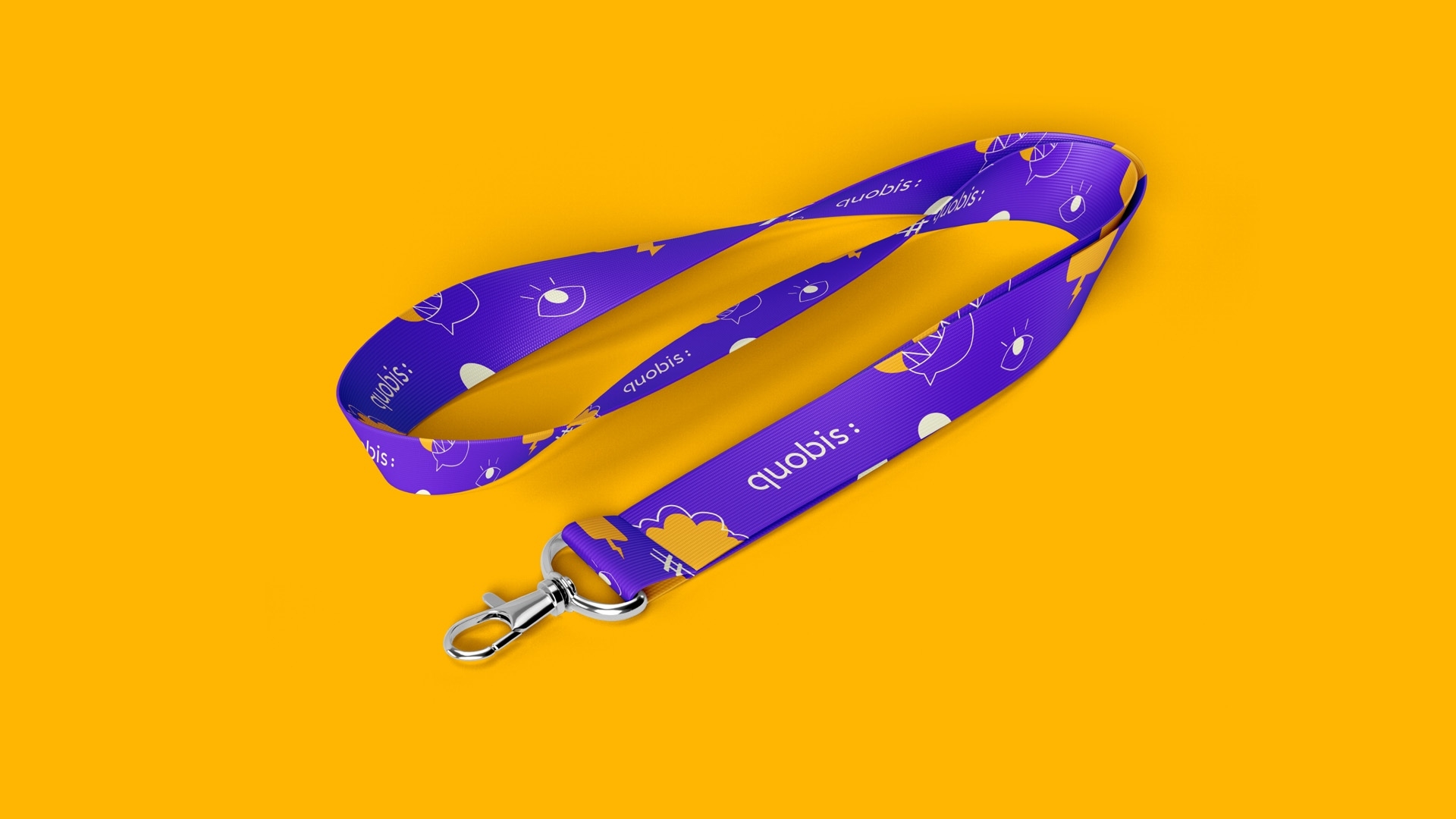
Making Quobis the beginning of the dialogue
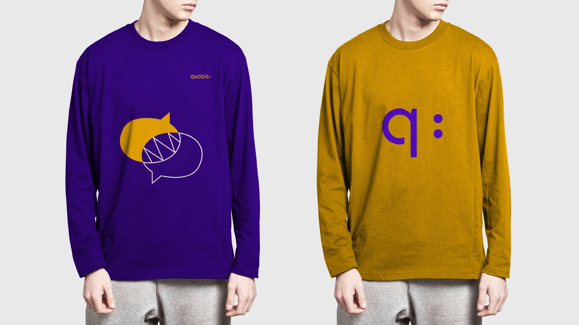
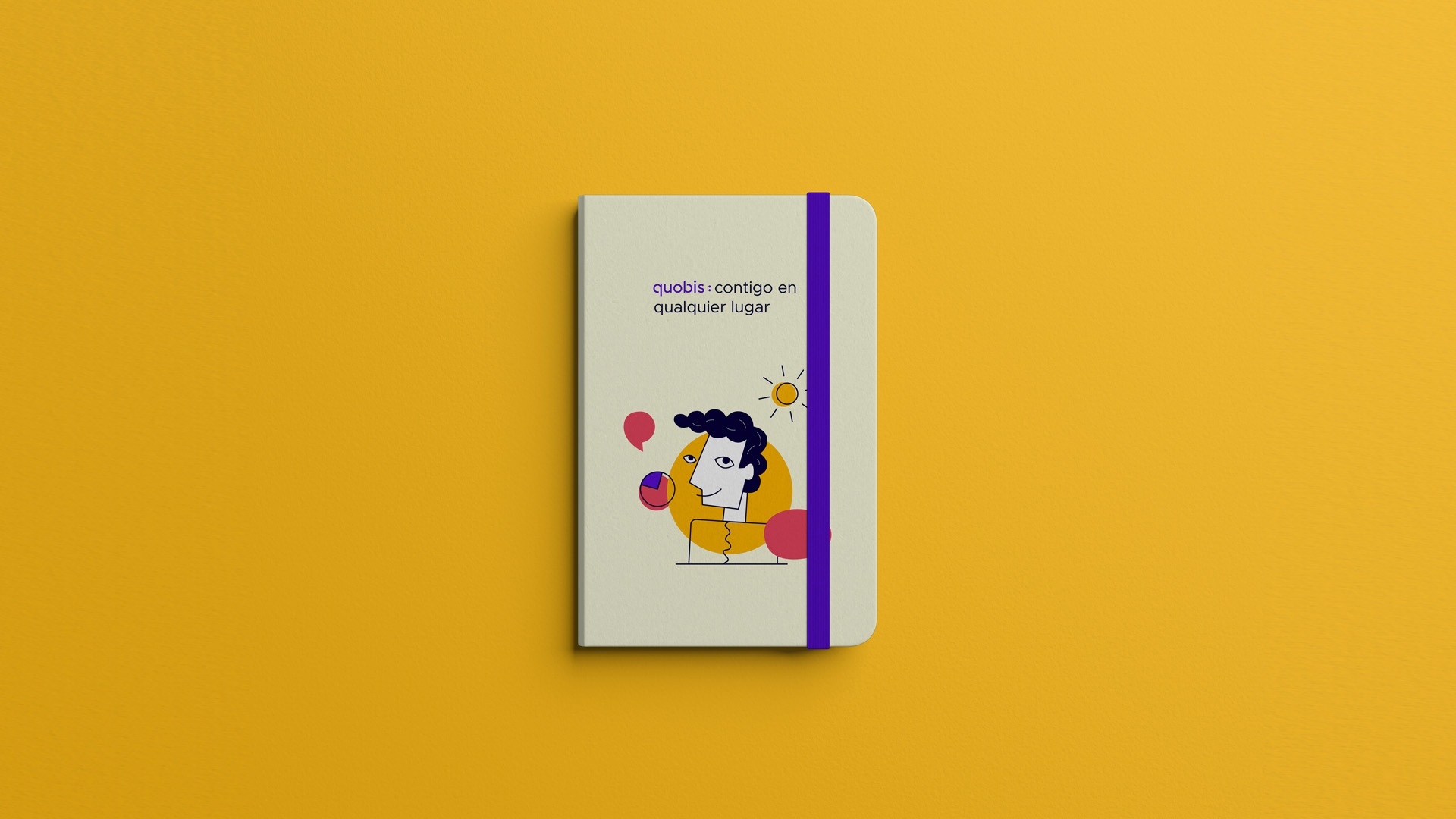
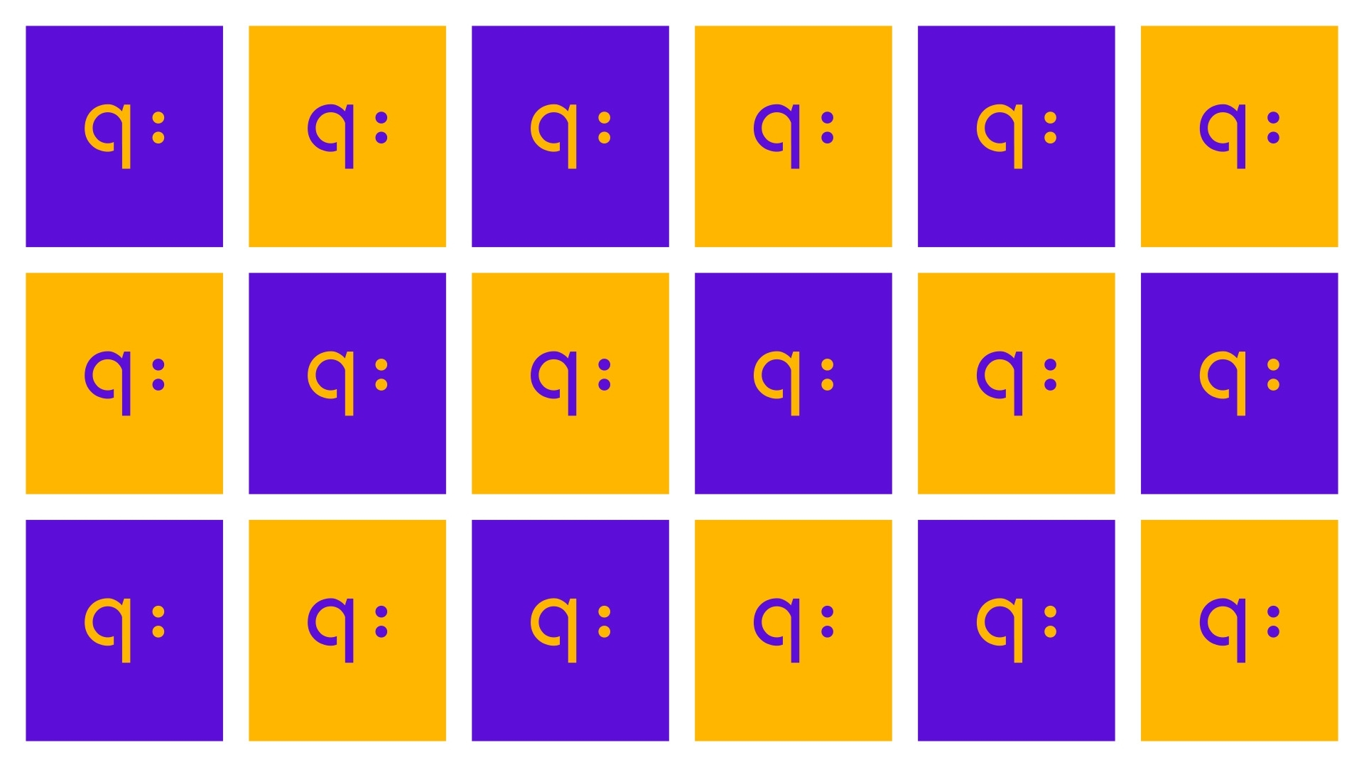
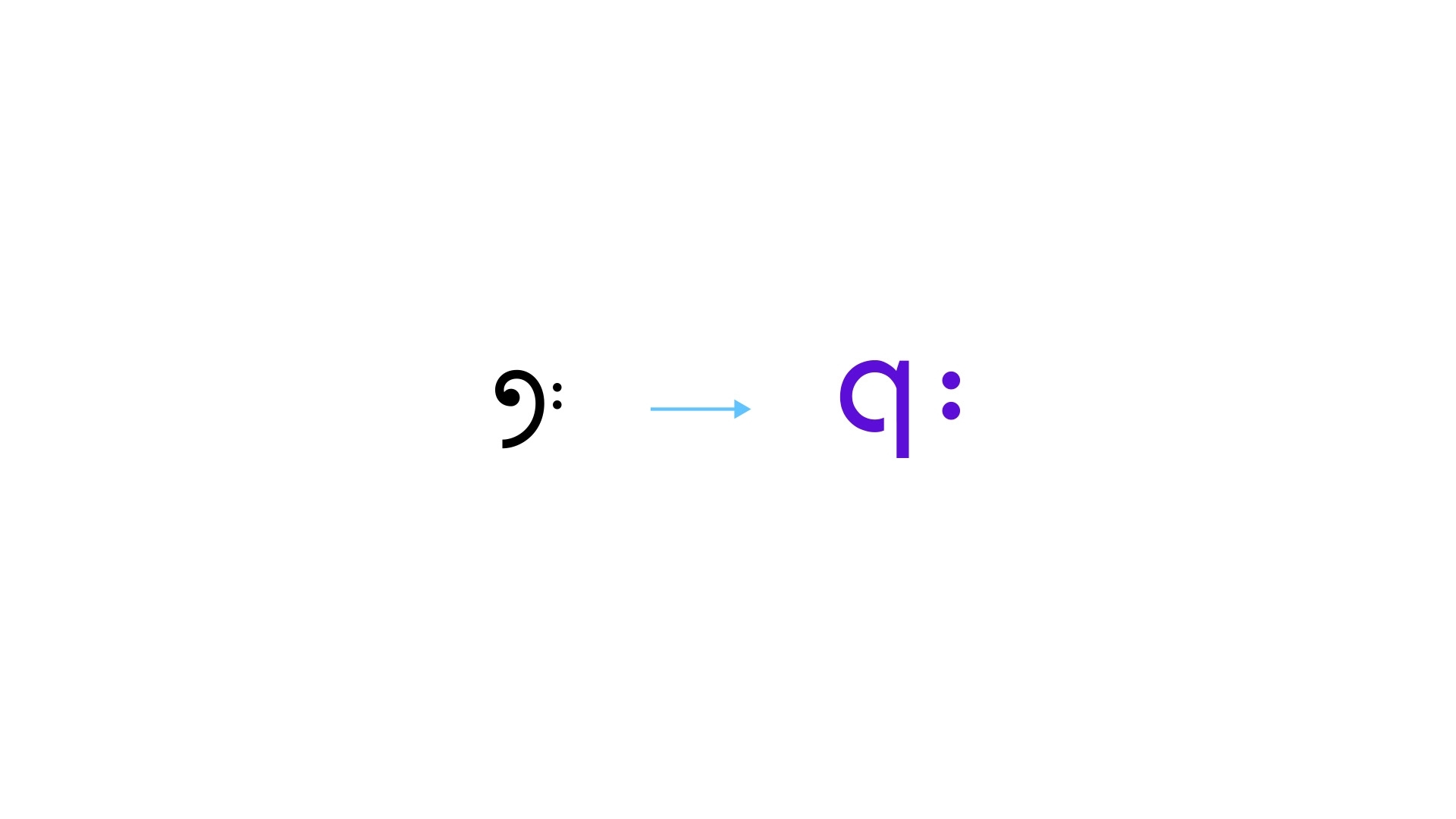
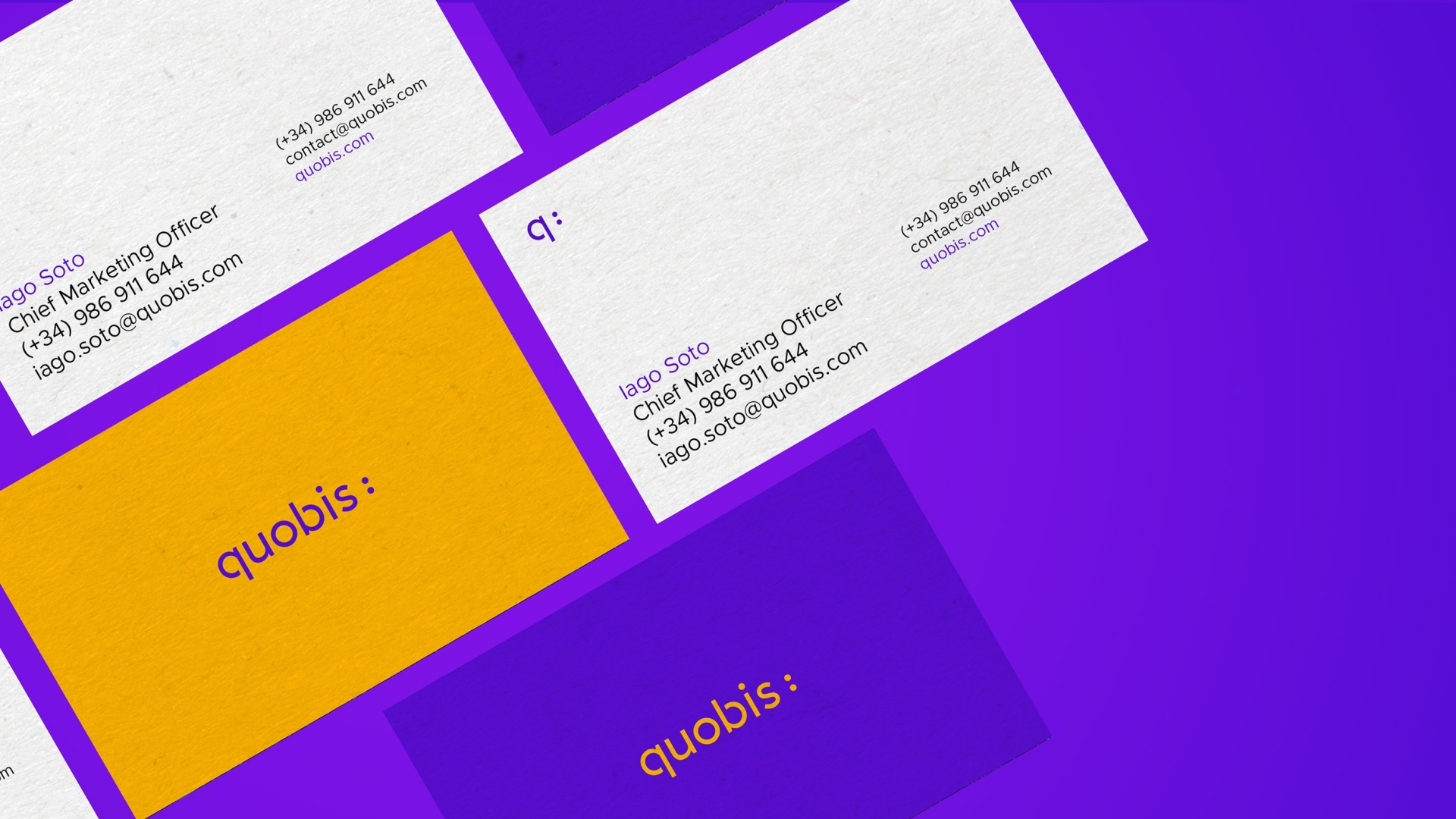
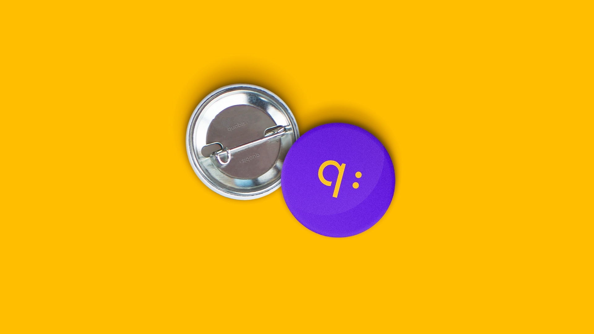
The brand as a message statement. The concept was inspired by recreating Quobis's objective: To improve communication through technology. It represented the dialogue of communication, and we used the icon that defines it - the ":".
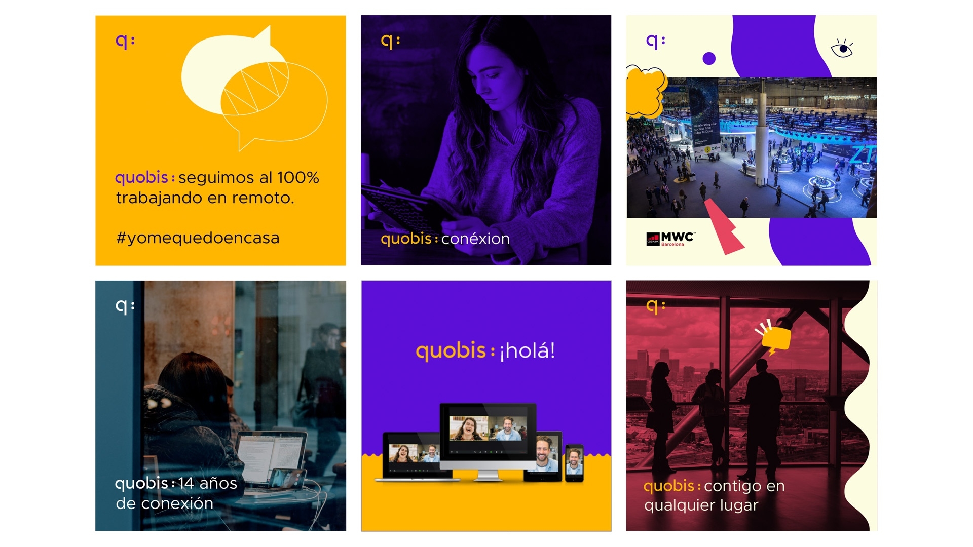
The dialogue also allowed us to humanize the brand
— Let's open a conversation
The iconology of the type was transformed in order to resemble the way we write music. It was a direct connection to one of Quobis's main objectives: To transform voice communication in corporations.

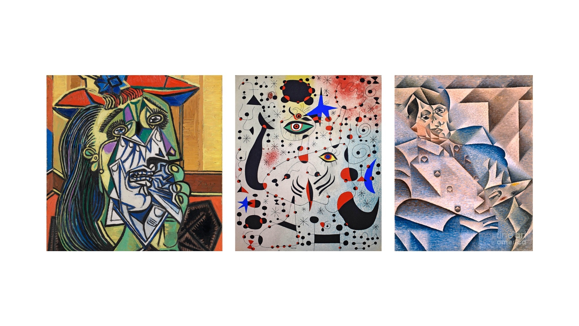
Turning Spain's artistic heritage into a modern fun feel
I was also inspired by the great Spanish painters such as Picasso to introduce a new series of digital illustrations and iconography that added a lot of character to the brand presence.